Friday, January 30, 2015

HOME DEPOT

"
         "More saving. More doing."
What they don't tell you is that the associates there are less likely to help.
Within the store itself it's very hard to get any person to help in any way. When you find someone they have major attitude about helping , you know doing there job. So there slogan should say " more saving , you want buy much because you can't buy what you can't find". "more doing, because we won't help you find anything."

- mdelair 

Thursday, January 29, 2015

Logos and their TRUE meaning...

A brand that conveys it's intended message simply from it's logo and name is the Australian company Rip Curl. The logo alone says enough about what this company is all about. The simple but cool logo of the "R" in red captures the connection and association with the sun, blood, courage, and sacrifice almost like braving the next big wave. This is what these Aussie surfers from the 60s wanted to signify. Not only is this a sleek and sharp design but it also can be interpreted as the breaking of a wave. To me, this screams surfing, waves, the beach and all that comes along. The name Rip Curl stands out as well. In the physical world, a rip curl is the lip of the wave that forms the mouth of a "barrel" when a wave begins to break and at first these were just words. Doug Warbrick, co-founder, later admitted, "Ripping was groovy; surfing the curl was groovy; we wanted to be groovy..so that was it." That right there says it all.

Companies that bother me the most with their ads, slogans and super cheesy commercials are the insurance companies. I know they are businesses I get it, but sometimes I think they exaggerate just a bit. Take Allstate for example; "You're in good hands". Please, tell me what this exactly entails. From what I've learned, these people are not always willing to lend that helping hand. A lot of times claims are denied, people can be refused coverage, and premiums are constantly increasing. I've had Geico for some time now and being a loyal customer I really haven't had any kind of compensation for being one.  Not to mention not being in an accident or receiving a ticket in years. I'm not asking for a lot just maybe lowered monthly payments? All I'm saying is that I think they over-do their advertising to the point where it's almost just plain ridiculous and they can sometimes be a hassle to deal with and not always "on your side". Oh, and I'm done with these meaningless commercials that have nothing to do with insurance.
The secrets behind the surf company logo
Rip Curl North America | The Name 'Rip Curl' | Where did the name 'Rip Curl' come from?
Allstate – You are NOT in Good Hands! | St. Louis Legal Examiner | St. Louis Missouri Personal Injury Lawyer


Wednesday, January 28, 2015

Messages in typography.

As seen in the Hanes sign this advertisement is not ledgable. It is very hard to figure out what the letters are by looking at it. It stands out because it looks pretty but then your eyes move to the other text automatically  because they are easier to read. In the hallmark advertisement  for valentine's day it is ledgable but the readability is bad. Because the love is pretty but the other words or more normal and you read those first for Saturday and February 14th. 

http://smad.jmu.edu/shen/webtype/read.html

Pandas and Apples, Burgers and Towers.

First things first, I am doing this post on four companies: World Wildlife Funds (WWF), Burger King (BK), Apple, and the World Trade Center (WTC). The two whose signs and logos clearly portray the companies meaning to me are WWF and BK while Apple's and WTC's logos both confused me on why they were made the way they were.


For those of you who have no idea about WWF, their logo is a panda. As for what the company is doing is quite simple, they raise money and awareness of endangered species across the world. Why this logo wasn't, say, a Bengal Tiger or African Elephant? It is because of a certain panda named Chi-Chi who was kept in a zoo in London back in 1961, the year this organization was founded. This symbol was chosen so people across the world of different languages and cultures would understand their company's message. Since the beginning the logo has changed and seemingly grown from a cub to an adult. This panda will most likely remain to be a symbol of the conservation movement and the logo for this company of WWF.
- References - http://www.worldwildlife.org/species/giant-panda

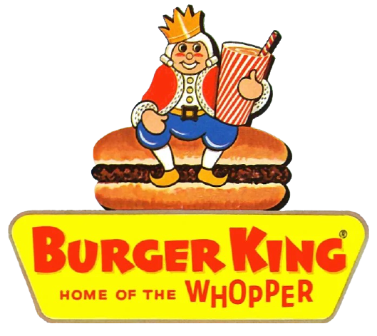
This Burger King logo from 1957 to 1969 is shown above and plainly shows what the company was selling, burgers and drinks. However the most recent logo is actually a lot more subtle about the burger reference. Today's version of this logo has hamburger buns holding together the text "Burger King." A site I found says that the logo "demonstrates an alluring and vivacious image of a fast food restaurant, which is ideal for the fast food culture amongst the teenagers. The sparkling colors used in the logo are vibrant enough to draw attention of the spectators."
- References - http://www.famouslogos.us/burger-king-logo/


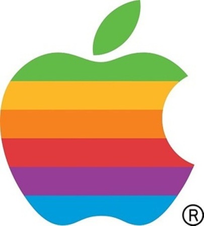
This company's choice of logos didn't make any sense to me, neither present day nor past logos. The logo shown above is the first logo for Apple Computer Company. It was created back in 1976 and depicts Sir Issac Newton under the tree from which the apple fell. In extremely tiny text, you can barely make out a phrase, "Newton... A mind forever voyaging through strange seas of thought... alone." This logo was created by Ronald Wayne, the third co-founder of the Apple company. The logo below shows an apple with a bite out of it. The common rumor surrounding this logo's creation was because of a man named Alan Turing, who committed suicide with a cyanide-laced apple. When Rob Janoff was confronted about this being the true reason, he laughed and said "What a wonderful urban legend." According to him, the bite on the Apple logo was to really let people know that it was an apple and not a cherry. The bite also played along with the computer buffs at that time because it had a similar sound off to the word ‘byte’, a unit of digital information in computing and telecommunication.


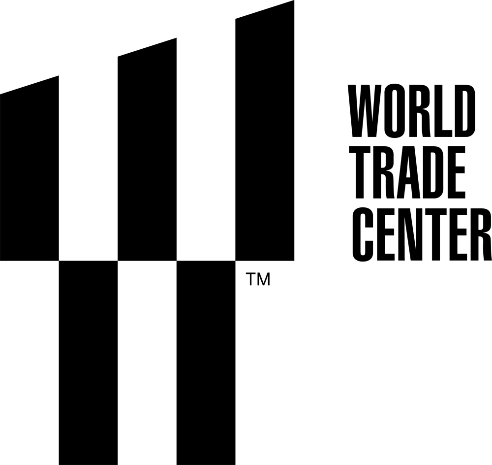
Here is my most tricky sign that I cannot understand fully. This is the logo for the World Trade Center and it is just a simple "W" right? WRONG! The "W" you see is supposed to represent the five towers that will be in the 16-acre lot in lower Manhattan of New York City. Wait, there is more to this logo than just representing the five towers. It also represents the twin towers which fell on 9/11. The three columns on the top half of the logo have two spaces which are supposed to represent the twin towers and their absence. and then finally all together it makes a "W" which stands for the World Trade Center or Westfield World Trade Center. Now I understand it after looking it up but I didn't even think of that all for the logo in the beginning.

Messaging in company logos

For this weeks discussion post, I was given the task to find a given message on a given company logo that gets noticed overall. I decided to choose chewing tobacco and the competing companies within. My go to choice, when buying chewing tobacco would be the brand Copenhagen. The reason for this is simply given on their can's logo. The phrase "Satisfaction since 1822 says it all. The word, satisfy, means to meet the expectation someone has for something, as well as to fulfill desire. I know, just by looking at that can, that others have been satisfied with this product since 1822. the font choice for such a phrase is also an advantage. The font is in Georgia typeface, which was inspired by the 19th century and calligraphy. This gives the can a sense of elegance and antique like feel. For a company to derive their phrase base upon tradition will gain loyal customers.  The can doesn't portray an image to express their product, just simple elegant text. Overall, to help my argument, Copenhagen's product is one of the oldest branded products still used in america.

The image to the left is an example of what the Copenhagen can looks like.


For my ineffective messaging logo, I chose the Apple Computer logo. This is because, without prior knowledge of the company, the apple logo would be confusing and misleading. I decided to dig up some information on why the company decided to use an apple as their logo. I came across a CNN article in which discusses numerous theories on what the apple meant. One reason that was given was based on a man named Alan Turing. Alan was one of the original people that helped lay out the fundamentals for computers. the connection Alan has with the apple logo derives from his suicidal death. Alan was facing jail time for gross indecency as well as the pressure he had from being a homosexual. Thus leading him to bite into an apple laced with cyanide. this became the creation of the apple in which has a bite taken out of it. Other allegations discuss that the apple meant knowledge, and the bite mark that is taken out of it was to differentiate it from a cherry. Overall, at first glance, the apple does not portray a computer company and their for is my choice of an ineffective message.

Bellow is an example of the Apple logo.


Works Cited:

Copenhagen-
http://en.wikipedia.org/wiki/Georgia_(typeface)
http://www.ussmokeless.com/en/cms/Company/History/default.aspx
Apple-
https://discussions.apple.com/thread/2812071?tstart=0
http://www.cnn.com/2011/10/06/opinion/apple-logo/


Monday, January 26, 2015

Messaging Sells

In this age of 24 hour media and service, it is difficult to process all the messaging that surrounds us. Some messages penetrate, and some get lost in the din. What is it that makes a message stick the mental landing? How does it manage to get noticed while so many others are ignored?

Take McDonald’s as an easy example. Aside from the Justin Timberlake jingle (ba-duh-bup-bup-bah), the current McDonalds slogan—I’m lovin’ it—created by a German advertising agency in 2003, was uniquely, for the time, set in all lowercase.


McDonald’s claimed “It will rekindle the emotional bond our customers have with McDonald’s through a campaign that depicts how people live, what they love about life and what they love about McDonald’s.”

The slogan is the company’s most profitable and successful campaign to date, surpassing the previous “You deserve a break today.” The Slogan Doctor, reporting in business magazine Management Today, declares “From the lower case 'i', declaring a youthful disregard for grammar, to the mysterious 'it', this slogan is desperate to give Big Mac a tiny hint of outlaw chic.”

Improper grammar though it may be, it instantly conveys the McDonald’s message, and partly due to the typography. Think that the type isn’t important? Try to imagine the type behind “It takes two hands to handle a Whopper” or “We speak fish.” For that matter, what about the typography for “Two all-beef patties, special sauce, lettuce, cheese, pickles, onions on a sesame seed bun?”

And then there’s Starbucks. Which recently eliminated text from its logo altogether.
For your initial post by Wednesday at midnight, please provide a link to two examples: an example of very effective messaging (a symbol that instantly conveys the precise intended meaning), as well as an example of ineffective messaging (a symbol that causes confusion). Explain why...not just why you personally think "why," but support your position with cited evidence. Critical Thinking! Do your research.

For your second post by the end of the week, respond to the findings of your peers. Add additional support or defend a different position. Perhaps you think it is a totally ineffective message or can give an example of a better (stronger/longer-lasting) message.

Sunday, January 25, 2015


While I was at Disney World this past weekend with my husband, I had the opportunity to observe a lot of different things.  One of the things that I thought was really interesting was a display of what looked like marble slabs at the entrance to World Showcase in Epcot.  I don't recall ever seeing them on my previous trips.  From a distance the structure simply looked like pieces of marble standing in an upright position secured in a type of base.  (These also resembled tombstones).  But upon closer inspection I realized that these pieces of shiny, flat rocks that resemble marble contained 1,000's of tiny little pictures of people.
The pictures of these slabs are of people that have been photographed while enjoying their day at the park.  I was really impressed at the amount of pictures there were.  I was expecting to see pictures of the military for as many as there were, but it was something completely different.


Thursday, January 22, 2015

The Handshake..

As I went through my day, observing the ordinary, I stopped for a second and noticed two men greet one another. Obviously knowing each other, the two men stuck out their arms and shook hands and then a question crossed my mind: why do we shake hands when we greet or introduce ourselves? When did this ritual start? Who developed this gesture, and why? I never really gave it a thought until now, so I did a little research. The handshake actually can date back to the 5th century B.C. in Greece and was a symbol of peace as well as showing that neither person was carrying any sort of weapon. In actuality, the handshake really began as an arm grab in which each person grabbed the other's forearm. This was another way of checking for a weapon, maybe a knife hidden up a sleeve. Also, this gesture goes back even further in history. In ancient times, some cultures believed the handshake was the transfer of power from a god to a king. A ruler would grab the hand of a statue of a god, believing he was creating the exchange of power from the god itself. As I think about it now, a simple gesture that we humans perform everyday, not giving a thought of why we do it in the first place, actually originated for a totally different reason than the reason for it in today's culture.

How Did This Whole Handshake Greeting Get Started?
Handshake History - Deep English

Subway cookies..

I'm actually going to do this one About my place of work. Since I'm kinda here right now. Haha. But as I was walking into Subway I smelled this delightful smell. It was like when you walk into your grandma's house after being gone for so long. The smell of fresh cookies being baked. It was a mixture of chocolate and oatmeal raisin. Now the chocolate chip cookies have chunks of chocolate in them to make them extra gooey. As I see many different company's do this put we here at subway have the extra chocolates. As for the oatmeal raisin cookies their soft and have lots of chewy raisins.

The Ball Point Pen

For this weeks discussion post, I wanted to take something we all use as students almost everyday. Let's say you are creating this news post on a piece of paper before typing it to the blog. Now, with this set in your mind, take a closer look at your writing utensil. If you are anything like myself, you would be using a ballpoint pen. The initial design of the ball point pen was to avoid many of the problems that derived from using a fountain pen. This helped with the constant need to refresh the ink of the pen by dipping it in an ink container.

The ball, which is located towards the end of the pen serves many purposes. The ball helps prevent the ink from bleeding out of the pen when not being used. this is done by a capillary action to keep the ink inside the pen. To add to the ball point, the creation of the cap came about to insure additional protection and leakage. The cap itself serves many purposes beside being a protection barrier. I dug a little deeper and found that the caps design was created to serve as a protection to the user as well. Being a small and detachable object, it becomes a chewable device we as adults sometimes find in our mouths as well as small infants. To insure the safety of the cap, a small end hole can be seen at the tip of the cap. This allows airflow through the cap if it were to get enlarge in someones throat. 
Now my attention was brought to the clip section of the cap. This is a nice and handy design created for simply what it's name derives from, a clip. Many use this to either clip the pen to the inside of your pocket, or to ones notebook. 

I wanted to take a look at the material the cap is created out of. This material is made of plastic, and being so, flexes under pressure. With this being said, if someone simply stepped on it, it would initially bend back into shape. It allows insures light weight, so the cap would float in water. 

Believe it or not, The ball point pen's first major jump into the 
world was during World War 2. This was during the years of 1939
through 1945, when pilots struggled with leaky pens at high altitudes.
Thus the creation of the ball point pen came about by Milton Reynalds.

That is a brief history/criminal mind view of the ball point pen.

Much of this knowledge I had received from a coworker who used to work at a pen production company, I also found some information at:
www.madehow.com/volume-3/ballpoint-pen.html

What goes bump every night on roads?

        Have you ever wondered about the reflective bumps in the middle of the road and why they are colored differently? These bumps are called Reflective Pavement Markers or Raised Pavement Markers (RPMs) and they serve a meaningful purpose. They come in six varieties of colors: red, green, blue, yellow, white, and then a combination between white and red. The red RPM shows that you are going the wrong way while white RPMs mean that you are going the right way down the road. Now you might ask what about the green and blue RPMs shown in the photo above? The blue are placed to catch the eye of an emergency vehicle driver and indicate the presence of a hydrant on the side of the road. Green serves many purposes, such as indicating a gated community's entrance for a emergency vehicle, utility company's roadside installation site to help their driver find it quickly, etc. They are made to withstand cars that may run over them, so they are naturally tough to move if not impossible. There are some that can be loose. These loose RPMs can be fatal as I found while researching their importance in other countries since a DJ was killed by a "cat's eye," as they are called in British areas due to their reflective nature being similar to a cat's eye when lit up at night. Not only are these RPMs used on the road, they are also used to show mailboxes at night, trail markers, and even art.
        The history of these RPMs starts back in 1934 with a British man named Percy Shaw who patented the "cat's eyes." The significance of these "cat's eyes" were made apparent during World War II because of the blackouts. In the 1960's, California came to have a fad of the road markers called Bott's Dots. These markers weren't usually reflective but described as "driving on Braille" if you ran over them. The modern RPM was born with an initial 1964 patent application, followed by another patent granted in 1986 that addressed the unique design requirements of any object that sits outside for the whole year on a busy road.
        What might I hear while I am close to these RPMs? Nothing unless I am in a moving vehicle. They make an annoying sound when you run over them and it can sound like you are riding with a flat tire. What do I see when a light reflects on it's surface? Well, it depends as I said before. I might see a soft red, white, blue, green, or yellow light reflecting back at me. What do I think when I look at these little bumps? I think nothing of them in the day time, but at night they are lifesavers since some lines aren't exactly well painted.

References: http://www.slate.com/blogs/the_eye/2014/01/23/what_s_that_thing_a_brief_history_of_reflective_pavement_markers.html


Bott's Dots


Night View of a road lit up with RPMs.
Art using raised pavement markers in a pedestrian tunnel at the Belleview RTD Station in Denver, Colo., 2008

week 3 ,observing Vaping on a deeper level.

The other day I observed myself vaping. Using a vaporizer to turn nicotine and vegetable oils with flavorings into flavored and scented "smoke" that dissipates shortly after being exhaled. The process was fascinating to me so I began to look into the differences in the process of smoking nicotine from a cigarette and from a vape, or E-Cig. Although the resulting exhalation appears similar in form to smoke, it is not and it evaporates so quickly, much more quickly than normal smoke without the burning smell. I looked into the history of vaping and discovered that the original idea of using water vapor was thought up in 2003 by a Chinese pharmacist, as an alternative to smoking cigarettes. It didn't reach America in 2006. The idea of vaping is that no tobacco is actually burned, it is a vaporization of oils including vegetable glycerin or polythelene glycol. The thing that makes vaping different is that nothing is actually burned. The oils and flavors are brought down to an atomic level and vaporized, leaving the user to be able to exhale water vapor. hence creating the illusion of "smoke" and helping conquer the mental aspect of smoking. As a former smoker, seeing the chemistry and science behind this seemingly insignificant piece of technology is truly astounding. I actually later found that the first e-cig prototype was patented in 1963! It was never commercially produced and my vape today is actually laden with LED displays. What a wacky turn of events!

-Corey, Fort Myers

Wednesday, January 21, 2015

Why is a stop sign red? A lot of people would say because red means stop or because it is noticeable. Well, there are a lot of noticeable colors we could use. (White, Yellow, Orange, etc.) Before I could drive I heard the saying "Seeing Red" which meant enraged and usually that person was dangerous when he/she was seeing red. Almost like there was no STOPPING them. So why is it red? Why does red mean stop? Who told us that? Well, it wasn't always red! In 1935 traffic engineers created the first uniform standards for road signage. "It was 166 pages long and recommended a yellow stop sign with black letters." - New York Times, December 2011. One of the things they had to get away from was that the stop signs looked like yellow warning signs. Also by changing it to red in 1954 made it consistent with the red signal lights. 

Here is the kicker. Why octagon? Why not square? They needed a shape that would be recognizable as a stop sign so it couldn't resemble another sign. Several countries have actually adopted the stop sign with the red and white. Japan uses a triangle(because they want to be different) but still use red and white. Now when you see an octagon sign you should be thinking Stop! 


 http://www.nytimes.com/2011/12/11/magazine/stop-sign.html?_r=0
http://www.trafficsign.us/yellowstop.html
http://www.myparkingsign.com/MPS/article_history-of-stop-sign.aspx

Monday, January 19, 2015

Week 3 Post: Deeply Observing the Ordinary

This week’s discussion is about the entire design process, rather than being specific about typography. Whether you plan on being an illustrator, a web developer, or a Disney animator, you will be confronted with creative challenges. Solving those problems will be your task, and your education should be focused on learning how to create under many situations.

As you make your way forward in your design career, you will continually encounter the term design thinking. Seems self-explanatory, but if you imagined that design thinking was simply the way designers go about creating, then you’ve been missing the benefits of engaging fully in the design process.

Award-winning global design firm IDEO describes design thinking as being “about believing we can make a difference, and having an intentional process in order to get to new, relevant solutions that create positive impact. Design Thinking gives you faith in your creative abilities and a process for transforming difficult challenges into opportunities for design.”

As designers, we are constantly honing our own design process. How do you work best? In long continual stretches? In fits and starts? Beginning with sketches? Letting your subconscious mull over the design problem?

Whatever your process, it’s what puts design thinking into action.

Again, according to IDEO, design thinking “has five phases (of) development, from identifying a design challenge to finding and building a solution.

Good design thinkers observe. Great design thinkers observe the ordinary.

At least once this week, stop and take a second look at some ordinary situation that you would normally look at only once (or not at all)—as if you were a detective at a crime scene. Be curious about the familiar things we normally take for granted. Why are manhole covers round? Why is my son/daughter heading off to school dressed like that? How do I know how far back I should stand from the person in front of me in line?

Make notes so you can write about it.

Craft at minimum two short paragraphs detailing what you saw, smelled, heard, felt, and/or thought. If you noticed that manhole covers were all round, move in closer to see the cover in more detail. Is there a pattern on it? Why? Does there seem to be a way to get the cover easily (but not too easily) open? If necessary, do some research to see if you can discover the answer(s). What’s the history of manhole covers? Where are they made? Are they different in different regions, states, or countries? What kinds of things are hidden under manhole covers?

Deeply investigate (and cite your references), but make certain that you are putting in time observing one of these ordinary things. Don’t just glance… study.

If the first thing you stop to observe turns out to be less than interesting, either dig deeper into the subject (get down close to it, use a magnifying glass or other tool to help you learn more)… or find another ordinary object to observe.

Complete your observation and write about it by end of day Thursday (extra day due to the Monday holiday). Reply by the end of the week.

For your reply, pick one of your fellow students’ observations and do your own observation or research and add to the knowledge pool. What did you discover that is odd or extraordinary or fascinating about this ordinary thing? Write at least another paragraph (more than a couple of sentences) explaining what you learned.

This and all of the blog posts are critical thinking exercises, and will be graded on the thought that went into the discussion. You will also be graded on grammar, spelling, capitalization, and punctuation. (It’s a typography class.) Please do not gloss over your communication skills.

Friday, January 16, 2015

The Language of Design..

It is important to be able to speak the language of designers because as designers, we are trying to send a message to the consumers without speech. Instead, communicating that message in visual language. Using typography and knowing the language and different fonts, shapes, texture and type terminology, you could learn about the interaction between the look of type and what the type is actually saying. Also, understanding the language, you can learn the different kinds of emotion type is visually speaking. To be a good designer, a balance should be developed between the visual aspect and the verbal aspect of a design (Knight, 2012). I believe this is what makes having the knowledge of design language so important. It is also important when speaking with designers, most importantly if designers are collaborating on projects together. There can be an understanding in thoughts and ideas as well as communication between each other. This is an advantage of using type terminology. I think understanding the anatomy of type and being aware of how type can "speak" to us and express different moods through words can be the foundation of a great career as a designer.

When speaking with other designers, especially working together, the use of conventional terms can be more appropriate. As with any job, you become close with co-workers and having those close relationships, the work environment can be more relaxed and does not have to be so formal so to speak. To me, this is the best kind of working environment. Obviously, when interacting with clients or superiors in the work field, when presenting your work or when given details for a project to be done for clients, you want to sound knowledgeable with the proper vocabulary.

http://precious-forever.com/design-studio/
www.smashingmagazine.com/2012/04/13when-typography-speaks-louder-than-words/

Language of design

Like all fields design has its own language, I'm pretty sure that people in that field didn't sit down one day and decide to come up with new language to secluded everyone else. The language manly consist of meaning that may only be applied with in the design field its self. So knowing the language is to know your field. You don't want to be the only person that is lost in the conversation when the conversation its self is simple. Knowing the language allowes you to be the best at your career!

Wednesday, January 14, 2015

  It is important to be able to speak the language of designers for the simple fact of when I am around designers we will be able to understand each other better. Also, it is important since together we have to fight the ugliness that comes from nonprofessionals.
 “The life of a designer is a life of fight: fight against the ugliness. Just like a doctor fights against disease. For us, visual disease is what we have around, and what we try to do is to cure it, somehow, with design.”
      -Massimo Vignelli, Interviewee, Helvetica (2007)
  One big advantage is that it would be quicker to use the type terminology around people who knew what I was talking about. However, not everybody knows the terminology for type. I don’t believe talking to somebody who doesn't have any knowledge of the differences in type would understand me at all if I were to go into full blown detail about the structure of a letter in different font types. However if I were to talk with a designer who already had knowledge of what I was speaking about, then I would be technical and detailed about what I might say.

References:
Click here for the quote by Massimo Vignelli from Helvetica

The use of design and type terminology

     Their are many different reasons why communication with the language of design can help each individual accomplish the goals set for that particular project. In order to understand fully what a customer or a design group wants, the proper language must be used. This will give the design an equal balance in concept when each of the designers comprehend what they want to achieve.

      For example, I had to do a project a couple years ago with a group of students involving a special event. We had to create a greeting card for Saint Patricks day. We struggled in the beginning because we didn't understand each others concepts. When we spoke in terms of design, our concept started to form. The downside to using this language is that some principles of design language are not fully defined and can be misleading to others working with you.

    I personally would only use the design language when in the right environment. Working at a design company would be a good example of this. I would not however use this when giving  a public speech. To some, using such language would just sound like gibberish, and leave them with more questions then answers. When pitching a project idea, to say a former employer, I would simplify these terms, rather then use the full extent of which I learned. A great way to look at this would be to compare culture languages. If someone spoke spanish and no other language, you would want to use only that language, otherwise they wouldn't understand.
There is more to it than just saying I can communicate to another designer. I can actually get involved with a designer on a level that includes emotional content. By knowing correct terminology I can describe how I feel about the typeface down to a part of a letter. When explaining, you can break it down to where it is almost like describing different bones. Each letter has it's own anatomy. "Learning the anatomy of a typeface will help you articulate why you do or don't like a typeface instead of saying, “I don’t know, it just looks funny.” Trust me, I’ve been there. But it’s so much more effective (and more fun) to communicate with designers when you actually speak their language." 
 http://blog.hubspot.com/marketing/typography-terms-introduction

Picture at top:  http://blog.hubspot.com/marketing/typography-fonts-guide

During a public speech is when I would say not to use terminology. Only for the fact that you are speaking to so many different people and possibly multiple languages. Terms can be confused into something else. I do not have actual sources saying this because I couldn't find them for when not to use terminology. However, this just seems to be what makes sense to me through my experience from teaching. One on one should be easy to use terminology even if they don't understand because if they are talking to you about it then they WANT to understand.


The history of Typography is so vast on how far back it goes and the different nations it was used in. Typography goes back so far that the Etymology of some terms like serif is not completely known.(from what I gathered) "The equivalent term in Japanese is "uruko" which means fish scales. In Chinese the term translated into English means forms with or made with legs." "So if someone tells you to “give it legs”, you’ll know that they are requesting a serif font. And if someone shouts “he has no legs!”, then I guess they’re looking at Helvetica." 
http://ilovetypography.com/2007/08/26/who-shot-the-serif-typography-terms/

 The history is important because it explains how we got here. It is our equation and we are the solution., (kinda makes sense right?)


The letters covered in snow gives an impression of cool weather or just something cold while the red lettering gives a sense of something hot. As for the downfall of the sign, why these different types? It goes from solid block letters to elegant curls. When I looked at this sign, it gave me too little emotion possibly from the types being so contradictory. I believe this sign just didn't even register what feeling the designer of this sign was going for.

 If you can't already tell from the bass jumping from the water with the reeds, this is part of a fishing business. There is a marina and a RV park owned by Roland Martin, a professional bass fisherman who lives in our community, and his wife. Now pretend that fish wasn't there and you didn't know Roland Martin, the type shown here has nothing to do with what the business does. When I look at the curls and such of Roland Martin's typeface, it seems like someone or some place elegant. Then looking at the simple lettering of where to ask about the RV park, it just kind of makes the places seem a little less elegant and more bland and boring. Also the sizing of the letters are quite confusing especially if you are driving 35mph and you only see this sign for a short enough time to only see the background of the sign and not much of the type. You would think the place to ask for the reservations would be more prominent but yet its just a tiny font compared to everything else.
This place only has one sign and it is on the side of its wall. Not only that but also you have to either be come from the same direction or down the road to see its sign. Also the type seems to change often. The FRIED CHICKEN can be kind of difficult to read going 40mph maybe 50mph, let alone the Dixie, Country Cooking, and Pork. Then again Dixie too close to read properly while even sitting still at the red light. Since none of the types match it seems like its a confusing place to be and while I understand that it would be eye-catching with the different stuff going on, I think it is a bit excessive since the "fried chicken" type could work with the "dixie" type. It would have made it would have given it a simple and homestyle feel rather than a confusing one.

Monday, January 12, 2015


Knowing the correct terminology and speaking the language of designers is imperative when working as a graphic designer.  Designers need to be able to communicate with one another and knowing the correct language and terminology makes that possible.  A time when you would not use the “designer language” is when you were talking to someone who was not a designer such as a client or anyone that would not have the knowledge of graphic design language.  Understanding the history of art, communication and design is also very important in order to be successful in the field of design.

http://wwwthewritemessage.com

Week Two Discussion Topic - Terminology for Everyone

One of your tasks this week has been to learn the language of typography, from terms to parts of individual characters. This jargon may be confusing at first, but knowing the correct names for specific parts is a valuable skill.

Designers work in a wide range of professions in large and small markets. Why is it important for a 3D animator to know the difference between a widow and an orphan? Why does a web designer need to understand the difference between Old Style and Modern typefaces? Ask yourself why, in fact, it is necessary to understand line, shape, texture, and negative space?

And history? Really? History? I thought we were done with history back in high school. What will knowledge of what Charlemagne did in 800 AD have to do with our success as designers? Seriously, who cares about cuneiform…or how it’s pronounced.

Let’s do some critical thinking here.

Why is it important to be able to speak in the language of designers? What are the advantages or disadvantages of using type terminology? When would you choose to use conventional terms and when would you choose to use the proper vocabulary?

Don’t just talk off the top of your head. Go see what other authorities say. Compare opinions. (Um, Wikipedia is not an authority.) Make sure to cite your references and be prepared to defend your opinions with facts. If you can provide an image as a concrete example, all the better.

For your reply, pick someone’s point of view that conflicts with yours and provide a counterpoint to their position. Again, cite your references and don’t just spout what you think… establish a connection with other designers and respected organizations like the AIGA.

Please make your initial blog post by midweek, and respond to at least one other student's post by Sunday at midnight.

Sunday, January 11, 2015


this one definitly has two different types i think that it makes the whole thing a bit more catchy imagine if you had to read the whole thing in the font thats on the top.


this is something i made in my kitchen a little messy but kinda cute


i chose this sign because the type is written in the same way the name sounds Pavillion Oaks. To me it has a whimsical and callagraphic feel to it.

My Type Photos

with this one I feel like the type is very professional and uniquely done. Its for a local catering business.

 it's simple and plain 

 again very simple but some nicely 

My typography photographs...

This signage definitely stood out to me. It seems to have a Castellar or a Rosewood Regular type to it, possibly Algerian. It reminded of one of those old western signage's for saloons.
 I absolutely love this one because they definitely designed this one using Papyrus. Papyrus was always one of my favorite fonts to use when I created certain projects.  

I took this one because generally had a simple Brush Script design to it. This one said to me simple but yet eye catching.

Various Type of the Town

 I chose Coco Locco because the way the colors are give off an island theme as if to be free of life. Being that it is a dance studio that could make sense. The font has almost a professional look with just a little bit off. Maybe to give it a crazy feel.

 The Font used for the Bait and Tackle seems to be a pretty straight forward message. I feel it gets to the point. Adding edging of white to the black font makes it stand out a little more with a 3D type of look.

 
8 Bit Hall of Fame!! Sorry that it is at an angle. It was stretched across the building so I shot it at an angle. I definately like how they used an 8 bit looking type that reminds you of a retro video game. It fits the store perfect being that it is a store to buy a ton of retro games and devices. The font makes you think of these games that you played when you were a child therefor bringing up good memories and making this place feel friendly.